A few life events set me back a bit. What’s new, right?
My mentor rightfully pointed out that while Rest Enforcer (glad I eventually changed that name) could be efficient, it was far too simplified. The product could be useful in more ways, and it was up to me to use the research to find those ways. So, I went back to sketching, and tried to discover how a potential user might benefit from this project.
I still had my sticky notes, as well as all my photos of them grouped, and I wanted to see what I’d either missed or simply didn’t delve deep enough into. Turns out, it was a lot.
Sticky notes of various colors keep the eye from getting bored.
Interviewees wanted simple, but they also needed goal marking, a buddy system, and control over their time. Easy-to-discover visual options and uncomplicated UI would be the objectives to strive for. As someone new to this whole thing, those weren’t targets I could quickly hit, but trying to work too quickly was the problem in the first iteration. I told myself the same thing I’ve bored students half to death with over the years: show up, do the work, and don’t be an asshole. To discover what the user might respond to, I had to think like the user.
The Most Basic of User Flows
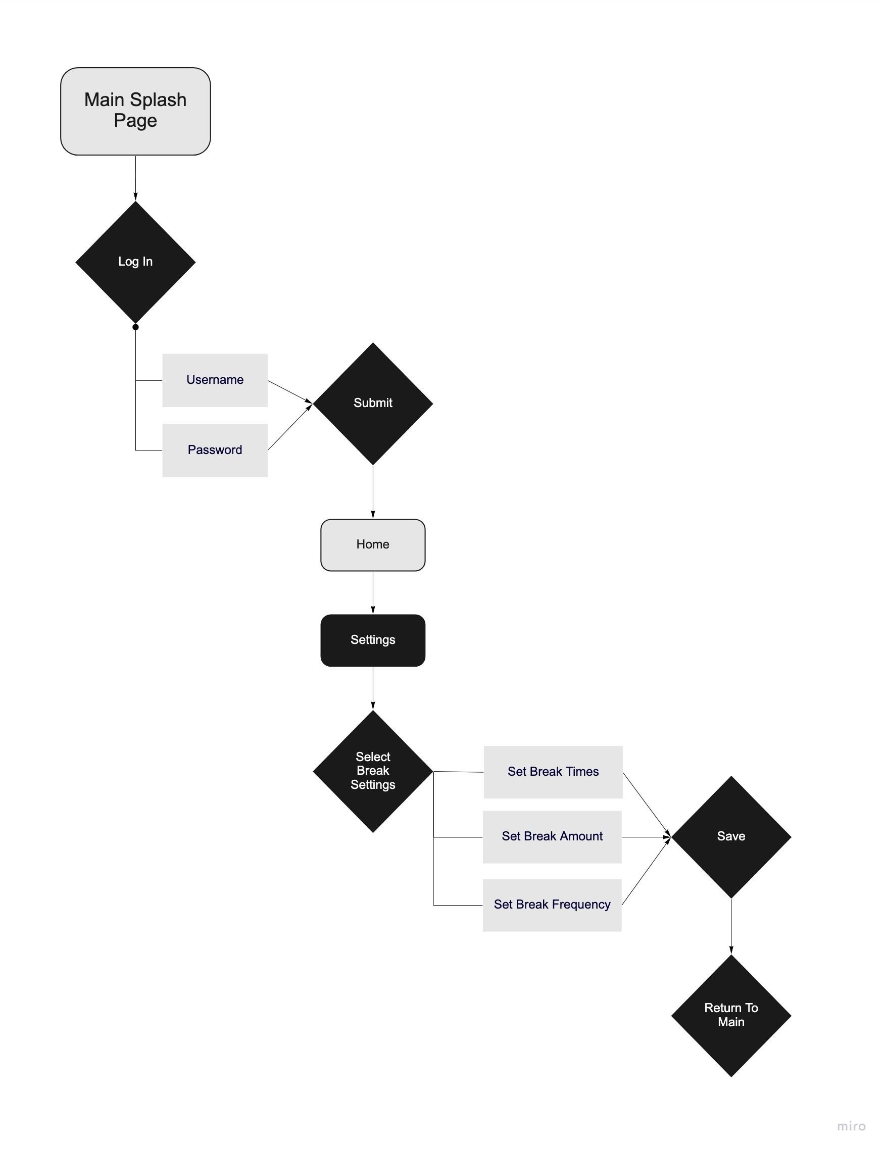
In order to keep track of their rest, users would need to set up an account. A simple flow, in my mind, was to open the app, go to the login page, input information, and then go to user settings to set up how the app should look and feel based on a user’s individual needs.
The break time settings would also need to be extremely user-friendly; at this point, the UI was still inspired by Breakbot.
Getting to this very early point was a lot of work, and yet nothing was done. I enjoyed parsing interview information, checking over research, and deciding on a basic flow, and yet I had no idea how all this would end up.
This portion of the project felt extremely similar to preproduction on an animated film. There’s the idea, and then the research, and then the sketches from that research. This was the first green bubble I could fill in on the production calendar. It was the logline and the script. Thinking about it this way made me a lot more comfortable. Instead of feeling overwhelmed with new information, I could segment it into mental folders I already had. With the script/user flow done, it was time to whip up storyboards: wireflows.

