Augmented Hospitality

I CREATED an AR experience at work.

Here’s my retrospective.

Summary

I currently work for a catering and events company doing internal graphic design, marketing, and special projects support (among lots of other things). Over time, I’ve noticed that the main focus for guests arriving at our events is locating the bars and the food before they get settled in (honestly, same). I’ve been wanting to learn how to create large-scale AR experiences, so I decided to work on solving both issues. I pitched a project in which guests could look through their phones and see directions to the food stations and bars. In order to accomplish this, I’d need several months, time to scan rooms, and resources to get it done.

In response, I was given 3.5 weeks and the entire weight of the project, so I had to heavily adjust my goals. While I’m impressed with my own ability to pivot so hard, it was a frustrating and eye-opening experience. I created a retrospective to drill down on what went right, what went wrong, and what I’d like to do next time.


The project ran from 11/10/23 - 12/8/23, to be ready for a 2,000 person event on the 8th. The parameters were simple: guests needed to find food and drinks during the event, and the AR needed to be simple to use even after several drinks.

Due to the limited timeline, I gave myself two, week-long sprints, with 1.5 weeks to finalize, hoping the sprints would clarify direction. They did!

Knowing very little about creating an experience like this turned out to be helpful, as I wasn’t beholden to any specific direction and could learn as much as possible within the limited amount of time I was given.

I researched several AR design companies that offered web-based experiences (having guests download an app would be one step too many when getting them to use the product), and signed up for a few free trials. Some of them crossed themselves off the list quickly, as they turned out not to offer the services I wanted after testing them a bit.


pain points

  • QR codes and other signage could not be attached to any walls

  • The most popular location in the building could not be utilized for signage

  • Guests were arriving on 2 different floors during the event, and the event itself spanned 3 full floors

  • Signs had to be 8.5”x11” or smaller, and there were limited frame options (number and size)

  • I was the only one working on this project

SUCCESSES

Several things went well. For starters, not only are many AR design sites simple to navigate, but they offer free trials. The paid versions cost as little as $10 per cast, depending on the company. This meant I was able to complete multiple sprints and 3 final casts for under $50 total.

Second, while AR online communities aren’t as robust as for VR, there were still people happy to respond to my beginner inquiries. They were a welcome addition to my current network, who I reached out to (read: frantically messaged) to discuss my goals and hurdles.

Overall, I created a simple AR experience spanning 3 floors in 3.5 weeks, where guests could scan QR codes to view the locations of 8 food and drink locations on maps of each floor. I designed iconography, edited maps, and learned several AR design styles.


Lessons

  • I spent too much time trying to make a specific AR style work, when I should have moved on.

    I started big, with geocasting. While it was a fun idea, a full week of trying to make it work for my needs wasn’t the right move. I now understand how it works for future activities, which I will be very excited about when I have the resources to use it.

  • I didn’t make nearly enough signage.

    This was the big one. Even with a list of several locations on each floor, and several signs at those locations, it simply wasn’t enough. I needed much, much more.

  • My biggest lesson was that I should have pushed back much harder about the deadline.

    While I accomplished a lot in those nearly 4 weeks, it simply was not enough time to create the robust project I originally pitched, especially since I had no in-house technical help.

I was initially disappointed in the disparity between what this project could have been and what it was, but after reaching out again to my network (read: more frantic messaging), I’ve made my peace with it. I wanted a big splash, and I got steady AR legs instead. I think that’s much better.

Special thanks to Fredric Van Freeman, the fantastic immersive tech consultant, and Justin Copenhaver of Urality, for being patient enough to go over this project with me after it was done, giving me pointers for the future, and assuring me that the failure to reach a robust and potentially absurd goal (but still hitting important marks) is not the end of the world. Importantly, they reminded me that working under 30% artistic delusion at all times is pretty darn rewarding when I see it in the right light. Lastly, thanks to my supportive supervisor Jess and my officemates, who do not work in tech, but don’t mind me tinkering in the corner on these weird little projects.

Strangers Are Nicer Than I Thought.

The left side of the image contains a list of attributes. The right side has color palettes matching to the attributes. At the bottom of the image are extra words and matching palettes given by participants.
A second participant's color results. The left side of the image contains a list of attributes. The right side has color palettes matching to the attributes. At the bottom of the image are extra words and matching palettes given by participants.

Sequential Philly’s redesign is bopping along.

Instead of hemming and hawing over color theory, I sent out a request for people to complete a short study about it.

I created 20 color palettes on coolors.co and numbered them 1-20, made a list of attributes/descriptors, and asked people to match the attributes to the palettes. At the end, I asked participants for any other vocabulary that came up as they were looking at the colors, and listed them underneath the main responses. I still have a few more tests to go, but so far the results are fascinating.

In these two examples, you can see that for one participant, some words had no specific palette match. For other words, multiple palettes felt accurate. I included words with both positive and negative connotations. Some of the extra terms participants gave at the end were surprising: “corporate,” “space,” “youthful,” and “dated” were ascribed to certain color groups that I wouldn’t have picked - and that’s exactly what I was looking for. So far, so good.

While the colors are being narrowed down, I’m also asking randos at cafes to complete card sorts for the site sections.

Groups of postcards with site sections written on them (like "events," "contact," etc) sit on a coffee table. The photo is from above.
Groups of postcards, different from the first photo, with site sections written on them (like "events," "contact," etc) sit on a coffee table. The photo is from above.

I see some patterns already, but I’m holding my tongue until all the results are in. The cafe participants were much calmer and kinder than I anticipated; I expected more pushback from strangers, but they’ve been excited to join these tests. This redesign has been a lovely experience so far.

Maps

The Yeah Yeah Yeahs are stuck in my head, and I am officially old.

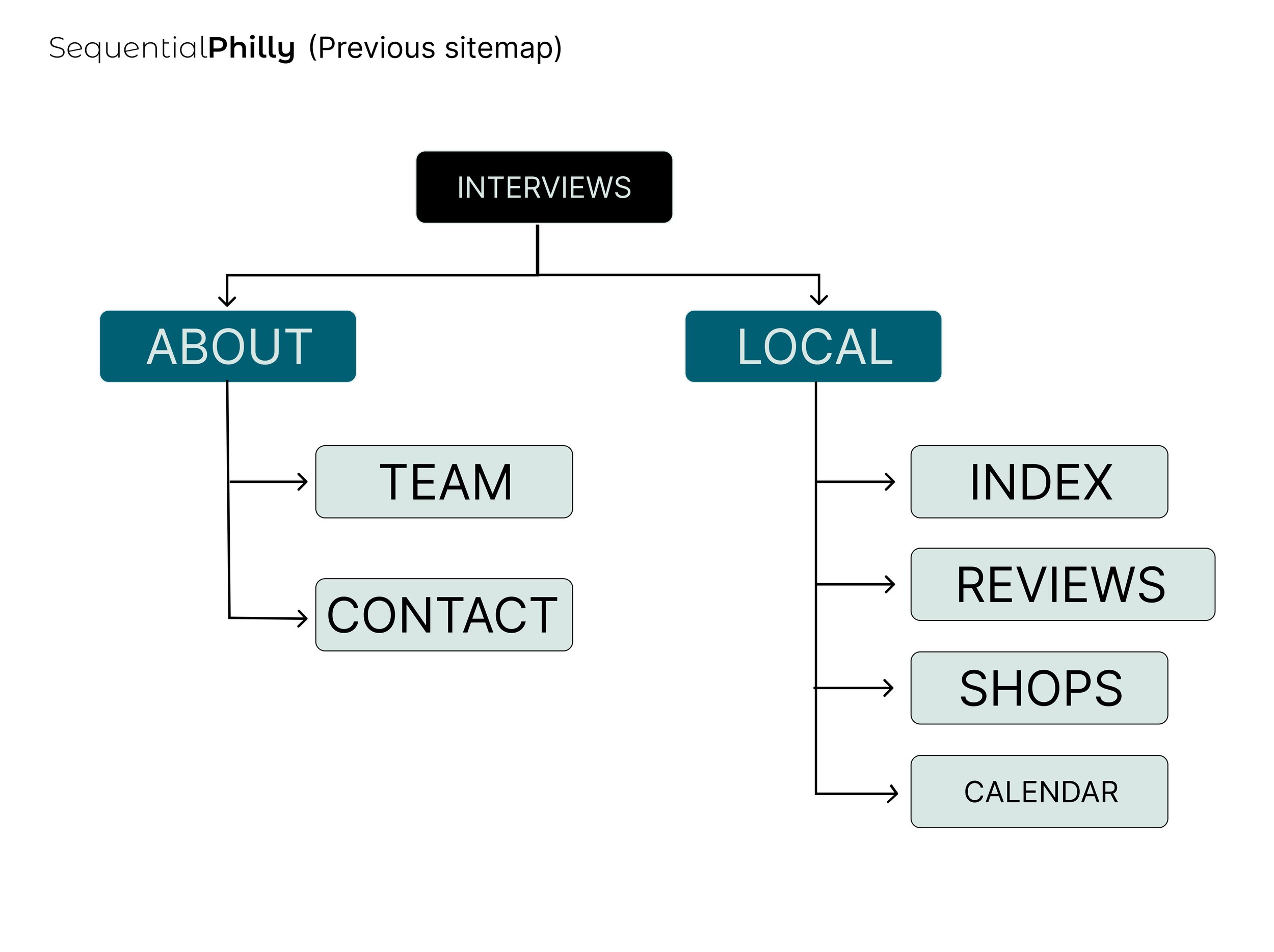
This isn’t a huge update; I realized I never documented the adjusted site map for Sequential Philly. The original looks like this:

A site map shows Interviews at the top, leading to the About and Local pages, which split into Team/Contact and Index/Reviews/Shops/Calendar respectively.

The site opened on interviews, with very little traffic going elsewhere. We had a couple local comic reviews/summaries in the previous version, as well, and a contact form.

SP has quickly moved from just the index of local cartoonists to a regularly updated feed of what’s going on in the comics world in Philadelphia. One of the takeaways from the surveys was that users felt they didn’t always know about events in time to plan to go. Part of this is due to the way Instagram’s feed is currently set up (users have to change the default order manually), but SP needed to be proactive with a solution. This led to the redesigned site map:

This site map has Calendar at the top, leading to About and Local. About leads to Team and News, and Local leads to Index/Shops/Interviews.

The new site opens on the calendar. This way, upcoming events will be less likely to be missed. The About section now also includes a News & Updates page for general updates, the Reviews page is gone, and Interviews are hosted in the Local section. Of course, this will be tested to make sure it works.

Refreshes On Refreshes

I made some minor changes to the layout of this site. I know I’ve been poking around Webflow for a few weeks, but since this portfolio is currently based on Squarespace it was easiest to change things up on here before migrating to a new space.

The image shows the Animation section of this website. The title "Jaz Malone" is at the top, with menu options below. Underneath is an animated gif of a woman holding a scale.

The main thing I did was to limit the imagery to one piece at a time. The previous design, a cascading gallery, was fun. I felt it could have been a lot to look at at once, and pared it down.

Previous layout of all the things at once

I repeated this layout for all pages under the Work section: Illustration, Animation, Comics & Zines, and Sketch Dump - oh, and I renamed the sketchbook section Sketch Dump. It felt more accurate.

Most likely, the site will get another minor refresh before the move to the Webflow base. I don’t dislike Squarespace - it’s kept my web presence going for years! Squarespace is easy to create with, easy to edit with, has great built-in templates, and the price points are accessible enough. The shift to a new platform is not about Squarespace, but about what I can do with a new (to me) platform. I have a need to learn new things when I see them. I’m happy both options exist.

Lemme Drone On For A Minute.

My voice is quite boring, and I love that for me.

In the following video, I compare the old Sequential Philly website to the low fidelity frames I’m cooking up based on user responses. Philadelphia has a thriving community of cartoonists, comic artists, and zine makers, and Sequential Philly was born in 2017 to help them collaborate more easily. SP does this by providing an index of locals, interviews with local creators, and an events calendar of local cartoon-related events. It was a fun side project for a while, and now it’s a thriving community with a robust social feed.

Once I got the hang of things, it started to go more smoothly. And once I get a set of positive responses from the prototype (gotta finish it first), I can take it into Webflow and build it out there. Should be fun!

Alright, Enough Sitting Around.

It’s been a couple weeks, I have brain space again, and I’ve decided to use that space to learn Webflow. As with all new things, it seemed daunting at first glance. But hats off to the Webflow creators, because I am having a grand old time.

Look at the clarity in the setup. There are even helpful reminders, like this one on the far right:

All the little things to discover, like the difference in containers vs sections, are so fun for me. I thought I’d have to slog through this process so I could add Webflow to my list of skills, but I’m surprised as how much I genuinely like working with it.


This post isn’t purely to drool over Webflow. I’m also pretty excited about revamping my favorite project, Sequential Philly.

I started SP in 2017, as a database of local comic and zine makers here in Philly. It quickly expanding into audio interviews of local creators, an events calendar, and a social feed. At the beginning of 2020, after a panel discussion with UPenn, a comic writer named Rick Chillot asked to join, and here we are today with an active feed, 13 audio interviews, a plethora of written interviews, and having given out 5 microgrants at the end of 2021.

It’s been 5 years, and I’m fresh off learning more about how to help users get the best experience. It’s time to take Sequential Philly another step forward. Rick and I created a survey for the local comics community. We’re gonna take those responses, distill them into goals, and leap as far forward as we can realistically go.

I think that’s the biggest thing I took from studying UX: it’s everywhere. It’s in projects I’ve already done, and it’s a huge part of the goals I have moving forward. In 2020, I took part in the Going With Grace death doula training, and even there, making death more comfortable for the people involved (and oh hey, that’s everyone!) is the main objective.

So, enough sitting around. I have a community to design for, comics to make, research to read, new snacks to discover, and a lot of options on Webflow.

Case Study Samba

If I Made A Case Study About Making A Case Study, What Would Be The Useful : Pointless Ratio?

I was warned that I’d need to learn to make a case study using this project. It seemed daunting to show the full process, but I come from a proud line of borderline hoarders and cautious savers, so I’d been documenting my work.

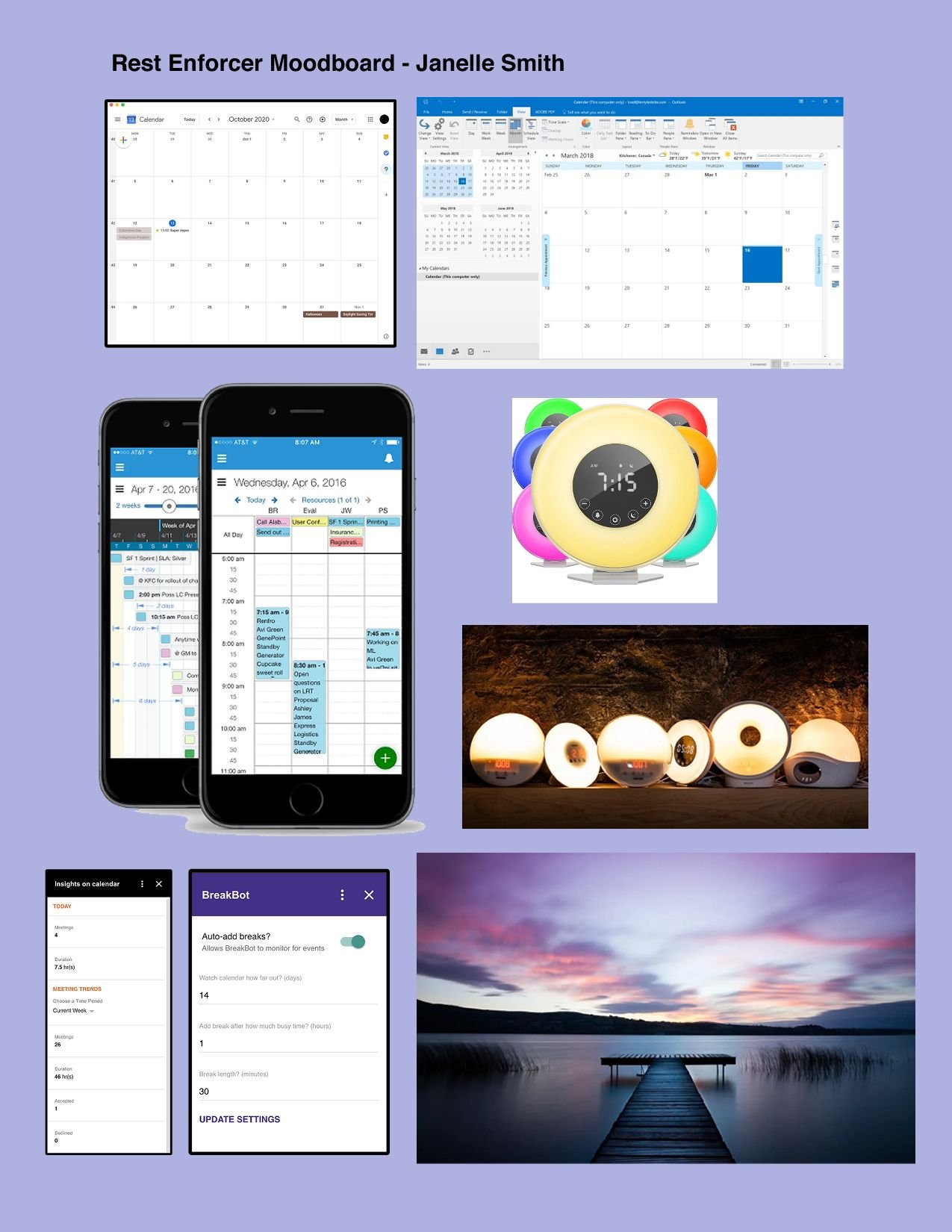
A case study is a presentation showing where your project started, where it ended, and how it got there, and each part of the presentation builds on the last. If you’re an animator, it’s similar to a show bible. The hardest thing for me was knowing exactly what to leave out. For instance, while but I’m happy to show them here, I didn’t end up needing to show both of the below mood boards in the study. Similarly, I have several iterations on my style sheet that would only clog space in a presentation.

The mood board on the left started out as the one on the right. At the time, I thought the old version was Clean. Simple. Elegant. Now I look at it and wonder why I was feeling so lethargic that week.

I was looking for a mood of naptime, softness at the end of day, a warm glow, and dusk. “Rest Enforcer” sounds like a jackbooted soldier will break down your door and chloroform you to sleep. That might be necessary in some cases, but it wasn’t the mental image I wanted to project, so after this point, the name changed to Down Time. That’s something to note in a study, too: if your project name changed, mention why.

It would be important to show what worked, what didn’t, and any research behind your choices. In my case (mild pun intended), I thought I was working on a visually accessible application, and quickly learned that I was not.

The early sketch for the Down Time splash page might take heavy cues from the mood board, but it simply did not work for its intended use. Yes, there are cute fireflies that I imagined would light up after the stars and moon appeared. I couldn’t pass up a chance to animate. But no one was going to see those stars, or those hills, against that sky and water. Most importantly, no one was going to see that title against that background with those low contrast levels. The color scheme shifted from sweet lavender to soothing violet to allow for more potential users, and in the case study, I explained why I changed this for the better. The stars are still faint, but it’s OK - they’re far less important than the title, and can be adjusted for future iterations. A case study really comes down to one question: What does the research suggest? My research said the color scheme needed more contrast.

Also note that I got much better at designing in Figma in the short time between creating those images. I’m proud of that.

At some point, I had a grandiose idea of creating multiple design options for the user. They could use a night option for a more restful feel, or a daytime design to get them in the mood for their hobbies during break times. I eventually left the daytime designs out of the case study, because not only did they not fit the narrative, but they had nothing to do with the research. I tested the daytime designs in a prototype, and they did not go over well with the majority of potential users. “I thought it would be cool” doesn’t make sense when no one wants it, so the bright designs got scrapped, I moved on, and my case study gained a more focused point of view.

My eventual study was 18 slides long. As always, I not only showed it to my mentor during updates, but sent it to some UX colleagues and presented it at a design critique for feedback. For my first go at this, I feel like I did an alright job. I’m looking forward to the point where I feel more comfortable going about this entire process. Right now, I’m in the “excited to not know so many things, comma, want to know more” phase. I kind of hope that never fully goes away.

"Done" Is My Safe Space

Fred Rodgers would have been amazing at UX. I have nothing else to say about that. I just think the job would suit him.

I was at the point in my project of making wireflows, and since I had access to the Adobe programs through my job, I started out using Adobe XD. I figured out the basics, and looked online for what I didn’t know. Of course, once I felt I understood it well enough, I heard Sketch was better to work with. Fine.

I switched to Sketch for a bit, but not for long. As it turned out, Sketch was all but irrelevant in the UX/UI community, and I should be using Figma. Cue rolling my eyes, loudly sighing, and going for a walk.

After the walk (and a snack, and losing a stare-down with my cat), I decided that I could not, in fact, stop the flow of time. I sat down to learn Figma. That didn’t last long, but I’d signed up for a UX Design critique meetup that week, and figured no one would notice if I wasn’t fluent in the program yet.

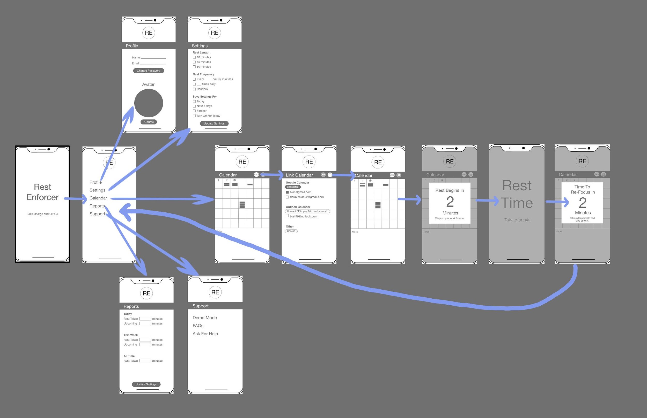
The original wireframes were done in Adobe XD. Before I learned how to properly link them, I added rudimentary arrows. Language exists to communicate; the format is usually irrelevant…is what I tell myself to feel better about how little time I spent on figuring out how to add links.

Here’s where I have too many people to thank. At the critique, we did the basic runaround: names, work background, favorite animal. Then they sent around the link for the critique space, which was in FigJam.

I did my best to hide my “What the heck is a FigJam?” face, but I didn’t have to hold it for long. The controls were remarkably easy to pick up. I learned a lot just from watching everyone else futz around with digital sticky notes and popping their wireframes onto the board for all invited to see. Whoever designed it clearly had the users in mind. I couldn’t say the same for other programs or apps coughAdobecough.

After the warmup, and listening to critiques on the work of a few absolute UX beasts who made me wonder why on earth I was in the same room, I put up my dinky little frames. Surprisingly, everyone was kind, direct, and honest. I figured my work would be smashed to pieces. And it was, but in ways that made sense. I was told what worked and why. I was shown what didn’t work, and given resources on how to make it better. I didn’t know what I didn’t know, and no one seemed to mind. They just pointed out issues and potential fixes, sent links to books, articles, and UI examples, and we moved on. Rational. Precise. Clear.

Spock would also be amazing at UX, but for different reasons than Fred.

It was so weirdly refreshing that I attended a second critique that week. This one included a few people from the first one, and I gathered a lot more data on my shabby little mockups, this time with a slight Figma refresh.

I keep dismissing my work, but I am proud of it. It was, after all, my first foray into this world. “Perfect” is the enemy of “Done,” and all that.

I now had pages and pages of scribbled notes and sketches based on several hours in two critiques in a week. I had notes from my mentor, and a long list of resources.

Most importantly, I had research. As long as I kept going back to that, I might not do a perfect job, but it would be light years better than winging it.

Simple Isn’t Simple

A few life events set me back a bit. What’s new, right?

My mentor rightfully pointed out that while Rest Enforcer (glad I eventually changed that name) could be efficient, it was far too simplified. The product could be useful in more ways, and it was up to me to use the research to find those ways. So, I went back to sketching, and tried to discover how a potential user might benefit from this project.

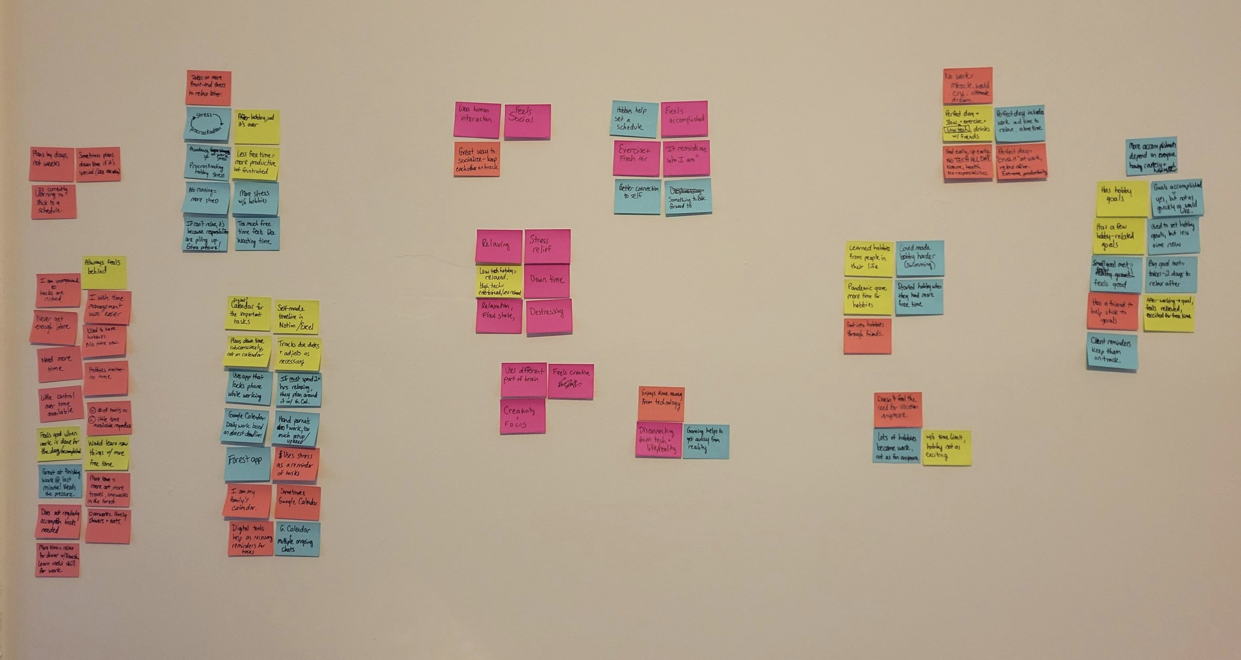
I still had my sticky notes, as well as all my photos of them grouped, and I wanted to see what I’d either missed or simply didn’t delve deep enough into. Turns out, it was a lot.


Sticky notes of various colors keep the eye from getting bored.

Interviewees wanted simple, but they also needed goal marking, a buddy system, and control over their time. Easy-to-discover visual options and uncomplicated UI would be the objectives to strive for. As someone new to this whole thing, those weren’t targets I could quickly hit, but trying to work too quickly was the problem in the first iteration. I told myself the same thing I’ve bored students half to death with over the years: show up, do the work, and don’t be an asshole. To discover what the user might respond to, I had to think like the user.

The Most Basic of User Flows

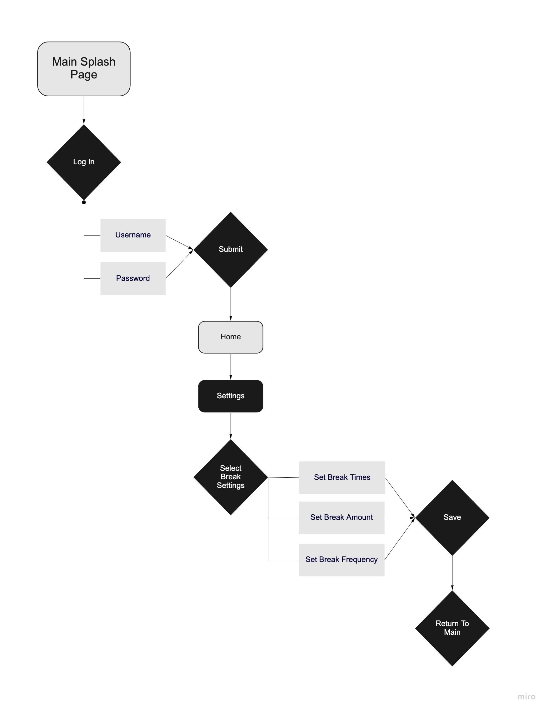
In order to keep track of their rest, users would need to set up an account. A simple flow, in my mind, was to open the app, go to the login page, input information, and then go to user settings to set up how the app should look and feel based on a user’s individual needs.

The break time settings would also need to be extremely user-friendly; at this point, the UI was still inspired by Breakbot.

Getting to this very early point was a lot of work, and yet nothing was done. I enjoyed parsing interview information, checking over research, and deciding on a basic flow, and yet I had no idea how all this would end up.

This portion of the project felt extremely similar to preproduction on an animated film. There’s the idea, and then the research, and then the sketches from that research. This was the first green bubble I could fill in on the production calendar. It was the logline and the script. Thinking about it this way made me a lot more comfortable. Instead of feeling overwhelmed with new information, I could segment it into mental folders I already had. With the script/user flow done, it was time to whip up storyboards: wireflows.

I Lied. I Struggled To Groove.

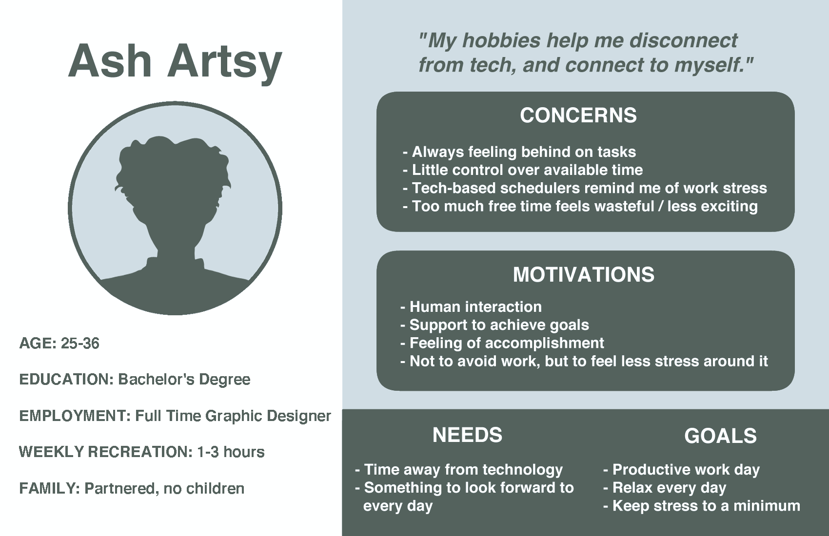
The design groove, I mean. General design skills are transferrable, but UI specific to iPhones and Androids was a new thing. Luckily, I could ease in with a persona sheet.

My persona wasn’t as polished as some others I looked at for reference. I originally made it pale green, with a forest green contrast and white offset. It was a bit too in-your-face, thus this toned down gray.

My potential user, based on my research, was a working adult with limited weekly recreation time. This “Ash Artsy” is possibly partnered, but does not have children (one at most). Ash finds work productivity important, but would like to truly relax during breaks from work, as they often spend their entire break time anxious about the next task. Most importantly, while they may use digital task managers, too much tech increases their stated stress; taking time away from screens is necessary to relaxation.

I broke Ash’s needs down into yet another sticky note chart. It was quite rudimentary.

See? Rudimentary as heck. I’m not too embarrassed; we all start in UX somewhere, right? I settled on an MVP (Minimum Viable Product). The product, whatever it would end up being, would help users take breaks every day, and to actually relax during those breaks. I decided they should also keep track of their rest progress, as goal-setting was a common thread in the interviews. Taking my cues from the digital calendar add-ons Breakbot and Insights, and remembering the apps I researched, I figured the product should be an add-on to an existing calendar. The potential user was looking for simple. I didn’t think they’d love a complicated, 100-screen monstrosity telling them to JUST RELAX. Simple was the name of the game.

I didn’t consider that simple was complicated to create. The shoddy, blurry, red route above was the result of my flying hubris hitting the brick wall of creative exhaustion. It would have to be redone. Everything would have to be reworked.

If I have earned the right to give tips, my tip would be this: if you’re not comfortable with creating, recreating, and then recreating, UX Design may not be for you. Simple may have been the name of my capstone game, but iteration is the name for UX/UI as a whole.

“Downloading.”

I’m still not used to the UX version of that term. Do we have to use it? Is it a suggestion or a requirement? Asking not for a friend, only me.

The interviews went well, so the next step was to parse relevant information. A stack of post-its and a sharpie run later, the wall was covered in quotes and opinions.

I’d asked about hobbies, but also about goals, ideas on rest, and overall time management woes. I found that most respondents held similar feelings about staying on task at work. They had a hard time with it, and didn’t put nearly as much thought into their breaks, even though taking breaks make them feel happier compared to not. It was hard to get out from under the looming shadow of productivity.

Some respondents had goals for their recreation. They wanted to jog more, or beat a game. Some wanted to be able to relax without worrying about what was next on their task list. Talking to people about rest reminded me a lot of teaching. Every couple of hours, I’d tell students to look up from their computers for 10-15 minutes, walk around, stretch, get water - just exist without the task at hand for a moment. It’s hard to do. I forget to take breaks myself all the time.

Now that I could see the information clearly laid out, I had to decide what to do with it. My previous assumption, based on hobbies, wasn’t quite in the direction the research was telling me to go. I decided to work on the problem of overworking, and how to help people build better habits around rest.

This kind of research was new territory, and I found it challenging and intriguing. Discovering common threads in interview responses felt like a new world had opened up. But I still didn’t feel fully at ease. Luckily, after research is design. And that groove was one I knew I could get into.

“So, What Would You Say You DO here?”

I had 2 jobs right out of college. I’d wake up at 5:30am, ride my bike to sling espresso at a cafe through 2pm, take a lunch break, and then ride over to a focus group call center and interrupt dinners until 10pm. I’d get up the next morning and do it all again, 5 days a week.

What this taught me, besides the sweet release of a midday nap, was that no one loves being questioned. Even if they chose to be questioned, it makes people uncomfortable to remember how they like their coffee before they’ve had it, or whether they’re between the ages of 35 and 48 and also love cheese. What made things a lot easier on all of us was me - the foolhardy human doing the questioning - learning to anticipate what might happen next. This was way easier in the coffee shop. The customer who always ordered a large green tea at 9:15am really loved having that tea ready to go right when they walked in the door. “3 Ice Cubes Lady” would never be happy with 4 ice cubes. But this was a little more difficult with the call center. And it was a lot more difficult with this capstone project. The issue in both spaces was that I had no product to supply, like coffee. I was asking people for very, very delayed, potential gratification.

I already believed everyone was overworked, but this wasn’t necessarily true. If I offered a solution to a problem no one had, I’d have the equivalent of my first interaction with “3 Ice Cubes Lady” on my hands. “Why would you give me so many ice cubes? I didn’t ask for this.”

So, I did a screener survey. It wasn’t perfect, of course, but luckily my mentor pointed out its flaws before I sent it around. At the beginning, I focused on people’s hobbies, believing that’s where this project would go.

  • “How much time do you dedicate to hobbies and recreational activities each week?”

  • “Do you feel you dedicate enough time to your hobbies?”

  • “Do you have any goals related to your hobbies?”

In my baby UX-er brain, the existence of activities outside work was important to overall time management and stress relief. I received 21 survey responses (yay), and 9 direct contacts for individual interviews (double yay); the base number for interviewing was 5. I had almost double that, so I assumed (there’s that word again) that I was all set. I thought, “Man, I am crushing this UX thing.” Of course, creating a user-focused product relies on users, and users are people, and people are…well, finicky. Ice cubes, and all that.

Of the 9 contacts, 5 actually made an appointment to talk (bless them). 2 no-call-no-showed. 2 of the remaining 3 rescheduled after a prodding email. I did one interview with a friend without the appointment (thanks, Manny!), and one more person was gracious enough to do an interview and last-minute survey to help me out (thanks, Loisel!). I was then at exactly 5 interviews; it was a humbling result. I was not, in fact, crushing it.

I thought back to an old call center coworker who, when a potential focus group member slammed the phone on him after forgetting they’d signed up to be called, would simply switch voices and call someone else. His “gruff Jamaican” voice may not have made the callee comfortable, but his “old Midwestern grandma” voice just might. “Ya gotta pivot, hun!”

Anticipate and pivot. Names of the game.

Don’t Overthink It, Just Add Another Burger Menu

Thank goodness things aren’t that simple. I’m over the burger menu, the double-burger menu, and the burger menu leading to a smaller burger menu. Mainly because every time I think of it, my food delivery bill goes way up.

Before I even got to design a non-food menu on a product, I had to figure out a product. It took a while to figure out what my capstone project was going to be. List after crossed-out list eventually led to taking the same advice I’ve given students over and over: I should take a break. Everyone should take a break. I should build a project about taking breaks.

As it turns out, you can’t build 6 months of work off an assumption alone. That feeling of accomplishment from thinking about doing work wouldn’t cut it. I had a presentation coming up for my mentor; here’s the slide showing my agenda for that meeting:

I assumed (begin Ass of You And Me era) that like myself, most people built their life around responsibilities, and then collapsed in a pile during off hours — if off hours existed. I also assumed that when I suggested others take a break from work, that they benefited from walking around, drinking water, or otherwise not staring at their list of tasks. Again, an assumption doesn’t make a project. Neither does a page full of burger menus. I was still at square one.